OpenOffice (interactive)
Google (web)
Math Warehouse (web)
NCES (web)
d3 (web/code)
Octave (code)
Pygal (code)
Matplotlib (code)
Pie charts are a useful tool for displaying fractional values in data. Wikipedia mentions some heated criticism of this kind of chart, but the fact remains that they are widely-used, and useful, for certain kinds of data. Sure, if I want to compare value A against value B, then I would get a better visualisation using a line chart or a column chart, but if I'm interested in the fraction (of the whole) which A represents, and the fraction which B represents, then a pie chart can be a better choice.
Ok, excuses out of the way, I've decided I want to draw a pie chart. I want the image to look great, and I want to use free software to do it, if possible. In addition, it would be a bonus if I can generate a vector version of the pie chart (for example, svg) so that I can modify it after generation. Resizing the image, changing the fill style, or the borders, moving segments, adding or changing annotations, or whatever, is a lot easier if it's in vector format rather than raster. Then I can choose to export a raster image later if I want, or keep in vector format.
So what are my choices of software to do this for me? And do they work in a point-and-click way, or do they require some kind of programming? The following screenshots show some examples. Apart from colour schemes, the obvious differences lie in borders, antialiasing, labelling, legends and output formats. Some allow separating one or more segments out from the chart, and some allow titles. The order of the segments is usually fixed, either clockwise or anticlockwise from north, and matches the order in the legend (if any). So reversing the order of the segments may also reverse the legend.
|
OpenOffice (interactive) Google (web) Math Warehouse (web) NCES (web) d3 (web/code) Octave (code) Pygal (code) Matplotlib (code) |
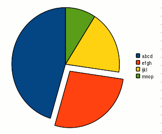
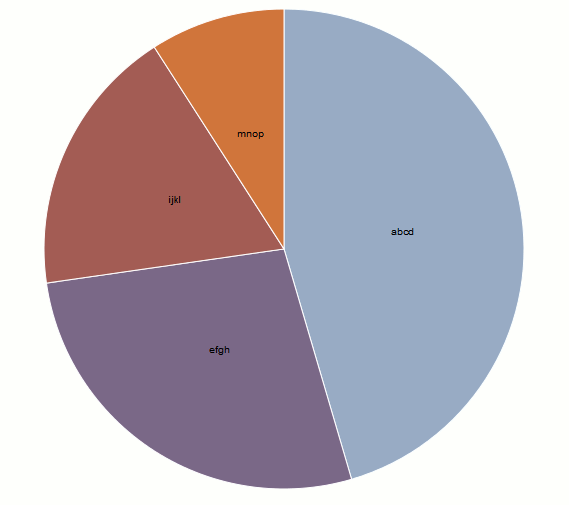
By far the easiest to use is OpenOffice (or LibreOffice). It's fully interactive, so you can enter and modify your data, create a pie chart, and then change its properties. You can even pull out segments, change colours and so on. But there's a limit to what you can do, and you can't get vector output. Still, a screenshot (converted to png) will be adequate for most uses and will cost by far the least effort.
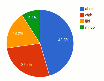
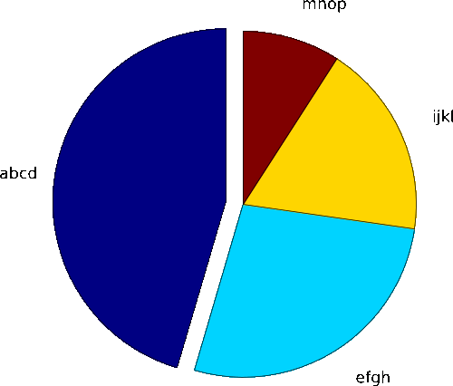
There are some web-based alternatives, requiring varying degrees of effort. One such option is Google's playground, which lets you create a boldly-coloured chart and control some of its properties. Only creates a bitmap though.
Two other examples of online programs are the Math Warehouse and NCES Kids' Zone (don't let the title scare you off). The NCES one also lets you select svg output, which opens up lots of further possibilities.
An interesting javascript-based option is d3, which produces some great-looking charts seen around the web. This example pie chart reads the data from a csv file, but in this case doesn't produce the most attractive output. It's possible that tweaking the html/js would improve the look though. This might be a good option for web-based presentation, if you can rely on javascript. Otherwise it would require grabbing a bitmap and editing it.
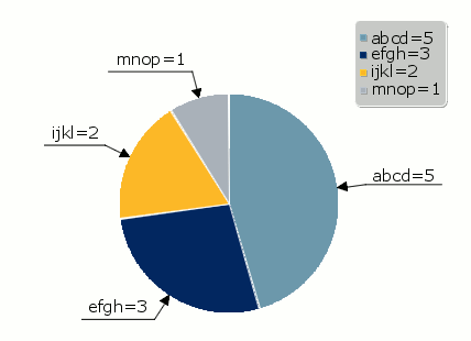
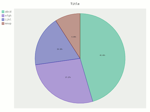
Moving more into the programming realm, the free software Octave lets you create pie charts either with the interactive code console or with a prepared script. You can then export to svg in the same way as any other chart.
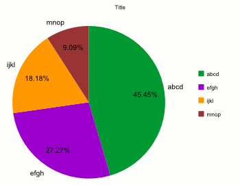
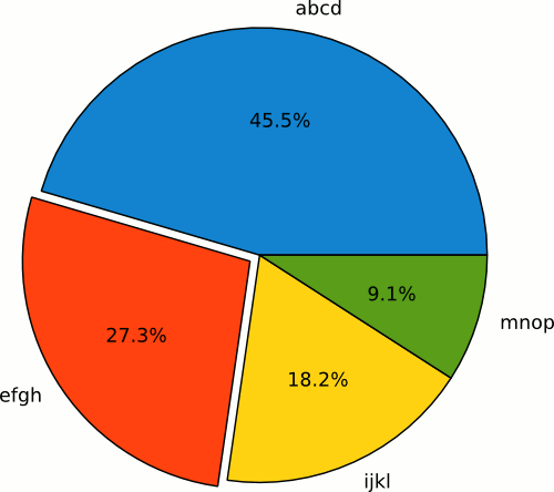
In the python world, Pygal is a python library for plotting with a multitude of styles and options (and very individual colour schemes). It also allows svg output, but requires writing python code. Similarly, matplotlib can be used by python programs to make some really beautiful charts. And the output can be saved as svg from the resulting window. Matplotlib is unusual in starting the graph from the east, rather than from the north (depending on the version it may be possible to specify this startangle).
Another option to try would have been the almighty gnuplot, but surprisingly it doesn't allow pie charts. At least, not without some significant hacking.
The easiest and fastest solution is OpenOffice (or LibreOffice). Just enter the data, make the graph, take a screenshot and tweak with Gimp. On the other hand, for vector output and great-looking results, Matplotlib is the best solution if you don't mind writing and running python code. Then you can save as svg, tweak in Inkscape, and compress the png with Gimp. Or you can keep it in svg format for efficient inclusion in pdfs, for example.